
The short answer is no.
One of the reasons the University did an identity refresh in 2015 is that it had so many units presenting themselves, externally, in many different ways. As a result, Penn State’s visual identity became chaotic, inconsistent and threatened to weaken our institutional brand.
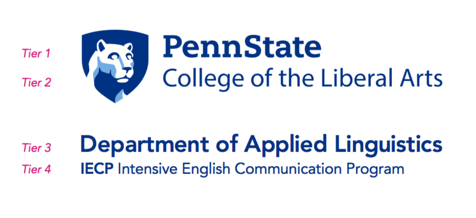
Departments and centers in the College of the Liberal Arts should use the college mark on promotional materials. This is the college’s main graphic identifier. This mark helps communicate where our departments, centers and programs live within the University.
This is part of the Penn State brand architecture.
Tier 1 – Penn State
Tier 2 – College of the Liberal Arts
Tier 3 – Department/Unit
You can not alter the Tier 1/Tier 2 mark, which is our Penn State/CLA mark. Your unit will fall within the Brand Tier 3 or 4 levels. That means the name of your department can be used along with the Liberal Arts mark but should not be visually attached to it. Do not put your department name right under the mark in a manner that would look like you are creating a new mark configuration. Place the title of your department in a typeface in the same area as the Liberal Arts mark, but it should be a separate element that does not compete with the mark, nor should it be so highly designed that it actually becomes its own logo.
An example of brand tiering done correctly:
View additional examples of the different tiers in Penn State’s Brand Book.
As we mentioned above, you don’t want your department name to be so highly designed that it becomes its own logo. However, departments can have their own word mark. What’s the difference between the two?
A logo involves more than just words. It typically includes a symbol or graphic along with text.
A word mark is stylized text. Below are examples of word marks created by Liberal Arts Information Technology. Notice that they are text-only, use Penn State-approved fonts, and use Beaver Blue or Nittany Navy, which are two of Penn State’s signature blues.
![]()

![]()
In addition, we recommend keeping your colors and fonts consistent across your promotional materials. Creating and using the same color palette and artwork, and placement of text starts to create a distinct look that will help people associate your promotional materials with your department. In addition to using the same fonts and colors across your materials, you can also incorporate secondary graphics, which are design elements that will help people identify your promotional materials.
Learn more about Penn State’s visual identity in the Penn State Brand Book. Reading through it will help you understand the entire identity system.
If you have additional questions, please email Kathy Swidwa at kea5102@psu.edu to learn more about creating a word mark.